sort 排序及分类筛选组件
介绍
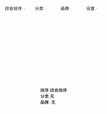
该组件为列表头部插槽中的可选组件。组件提供了简单的下拉排序及下拉分类筛选的功能。组件分为 sort 和 sort-item 两部分。
引入
在app.json或index.json中引入组件
json
"usingComponents": {
  "sort": "coolui-scroller/sort/index",
  "sort-item": "coolui-scroller/sort/item"
}
代码演示
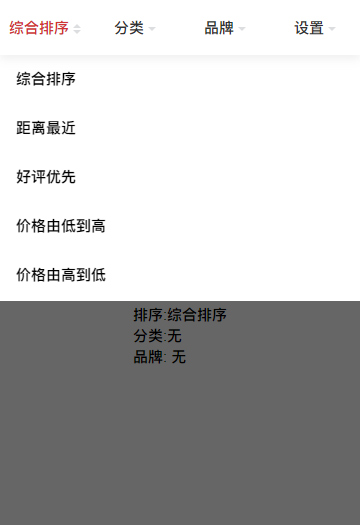
- 排序
设置 type 为 sort 模式,切换时头部文字会随着选中的内容的变化而变化
html
<sort>
  <sort-item
    title="排序"
    name="sort"
    type="sort"
    model:value="{{value1}}"
    options="{{options}}"
    activeColor="#d13435"
  >
  </sort-item>
</sort>
js
Page({
  data: {
    options: [
      {
        id: 1,
        title: '综合排序',
      },
      {
        id: 2,
        title: '距离最近',
      },
      {
        id: 3,
        title: '好评优先',
      },
      {
        id: 4,
        title: '价格由低到高',
      },
      {
        id: 5,
        title: '价格由高到低',
      },
      {
        id: 6,
        title: '其他',
      },
    ],
    value1: null,
  },
})- 单选
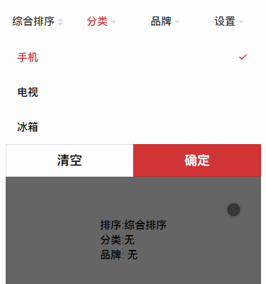
设置 type 为 classify 模式, 开启分类筛选模式, 默认为单选模式。默认为点击选项就切换。
html
<sort>
  <sort-item
    title="分类"
    name="sort2"
    type="classify"
    model:value="{{value2}}"
    options="{{options2}}"
    activeColor="#d13435"
  >
  </sort-item>
</sort>
js
Page({
  data: {
    options2: [
      {
        id: 1,
        title: '手机',
      },
      {
        id: 2,
        title: '电视',
      },
      {
        id: 3,
        title: '冰箱',
      },
    ],
    value2: null,
  },
})- 操作按钮
设置 action-bar,开启操作按钮。则只有点击确认按钮之后才切换。未点击确认按钮,关闭弹层,一切选择将作废。选择后 value 返回选中的 index
html
<sort>
  <sort-item
    title="分类"
    name="sort2"
    type="classify"
    model:value="{{value2}}"
    options="{{options2}}"
    activeColor="#d13435"
    action-bar
  >
  </sort-item>
</sort>
js
Page({
  data: {
    options2: [
      {
        id: 1,
        title: '手机',
      },
      {
        id: 2,
        title: '电视',
      },
      {
        id: 3,
        title: '冰箱',
      },
    ],
    value2: null,
  },
})- 多选
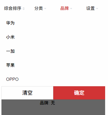
设置 multiple 为 true 模式, 开启多选模式。同时开启操作按钮,否则点击选项就直接关闭弹层了。
html
<sort-item
  title="品牌"
  name="sort3"
  type="classify"
  model:value="{{value3}}"
  options="{{options3}}"
  activeColor="#d13435"
  multiple
  action-bar
>
</sort-item>
js
Page({
  data: {
    options3: [
      {
        id: 1,
        title: '华为',
      },
      {
        id: 2,
        title: '小米',
      },
      {
        id: 3,
        title: '一加',
      },
      {
        id: 4,
        title: '苹果',
      },
      {
        id: 5,
        title: 'OPPO',
      },
    ],
    value3: null,
  },
})- 自定义 不设置 options,type 设置为 diy。 利用中间插槽自定义下拉内容,组件只提供下拉和关闭的功能,其他功能自由发挥喽~
html
<sort-item title="设置" name="sort4" type="diy" activeColor="#d13435">
  <view class="diy" bind:tap="close"> 自定义区域 </view>
</sort-item>
js
Page({
  close() {
    this.sort4 = this.selectComponent('#sort4')
    this.sort4.confirm()
  },
})
sort 配置
| 参数 | 说明 | 类型 | 默认值 | 版本 |
|---|---|---|---|---|
| overlay | 设置是否显示遮罩背景 | Boolean | true | 3.0.8 |
| overlayDuration | 设置遮罩背景动画的时间 | Number | 500 | 3.0.8 |
| scroll | 设置开启横向滚动,默认为false布局为 flex 布局, 随着 item 的个数增多, item 宽度越来越小。设置为true时开启横向滚动 item 默认显示 4 个半 | Boolean | false | 3.0.8 |
Item 配置
| 参数 | 说明 | 类型 | 默认值 | 版本 |
|---|---|---|---|---|
| type | 设置类型是排序还是筛选,可设置 sort 、classify 、diy,sort为排序模式。classify为分类模式。diy为自定义模式 | String | 3.0.8 | |
| title | 设置头部标题 | String | 3.0.8 | |
| name | 设置设置下拉的唯一标识,防止切换下拉冲突 | String | 3.0.8 | |
| value | 设置选中的值,支持双向绑定 model:value,单选时值为选中的 option 的 index 值,多选时为选中的 option 的 index 值的集合逗号分隔的字符串(如:0,1,2) | String | 3.0.8 | |
| options | 设置选项列表, 选项中 title 为选项的文字, id 为选项的 id | Array | 3.0.8 | |
| activeColor | 设置选中得文字颜色, 同时也设置操作按钮中确认按钮的颜色 | String | 3.0.8 | |
| multiple | 设置开启多选模式 | Boolean | false | 3.0.8 |
| action-bar | 设置开启操作按钮 | Boolean | false | 3.0.8 |
插槽
| 名称 | 说明 | 可用组件 |
|---|---|---|
| default | 自定义下拉插槽 |
方法
| 名称 | 用法 | 说明 | 返回参数 | 版本 |
|---|---|---|---|---|
| confirm | 先获取组件实例:const sort4 = this.selectComponent('#sort4');, 然后调用方法: sort4.confirm() | 自定义时关闭下拉的方法 | 无 | 3.0.8 |